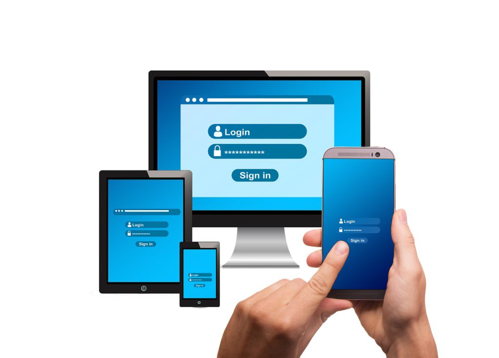
Your company announces that they’ve finally decided to implement a custom database app. They enthusiastically impart that this means no more multi-tab spreadsheets, brimming file cabinets, or hunting down information to complete tasks. Though you realize this is a long-overdue move for your business, you can’t help but feel a little intimidated. What if you suddenly find yourself a stranger in your own data land?
This may be the mindset of some personnel when their company decides to automate or upgrade their data management. Depending on how it’s built, users will view the new system as either a complex and dreary platform that bogs them down, or a welcoming, intuitive tool that supports their workflow. In both scenarios, the schema may be the same, but the UX (user experience) and UI (user interface) are what tip the scale either way.
Using Logic in UX Design
Another good UX strategy is more layouts, less fields, meaning that layouts offering too many functions can actually be counterproductive. Better to separate content by its defining purpose across several layout pages. Just think, we wouldn’t cram accounting, HR, and purchasing documents into one folder, why do the same with a layout?
Keeping UI Simple, Clean, and Easy to Read
As for aesthetics, simple, clean, and easy-to-read are always best. Good interface designs should also consider that users visit countless websites in their daily life and may want their database to be equally as appealing. Start with a coordinated palette of three or four colors, possibly from the company’s branding or existing website, to make the user feel at home. Leave enough white space between elements for balance, and place essential information in the upper left since that’s how most of us read.
Good developers know that vehicles built on logic show a strong understanding of who’ll be taking the wheel. As we strategize each layout page, we should be asking ourselves how we’d want it to function if we were the user? It’s not just about accessing data because the user could do that before. It’s about the ease with which they navigate, update, print, calculate, share, and generate reports from one centralized hub.
When building custom features to reflect a company’s needs, developers should also focus on tools that work across the board. Simple add-ins like tooltips for non-labeled buttons and breadcrumbs from every possible window help diminish confusion and frustration. Placing action buttons in the lower right of an interactive dialog window allows a seamless flow to the task at hand without having to retrace steps. When faced with a content-heavy portal, a clearly marked popover can help showcase relevant text and graphics without crowding the space.
None of these steps are revolutionary, but together they help present the user with a thoughtful layout. That’s why Reach Technology Group starts each project with a comprehensive discovery process in which we listen and learn. Being familiar with the nature of the data and how it’s to be applied helps us build great databases. Providing our customers with the experience they want is how we build great relationships.


